
Formula 1 season 2019 ended december 1st and all statistics are now final. Five drivers from three teams managed to dominate almost all grand prix this year. I decided to try and see what kinds of graphs could be made from the basic stats about this season and what kinds of patterns would emerge from them.
First (above) is a calendar of alle races with podium wins and pole positions. The colours which represent teams make the patterns stand out.

Next up is the same data (minus the date) shown distributed around the globe. Time-zone and temperature information could be added to see what kind of influence this has on race-results.

While still focussing on the top five drivers this grap shows their results per race as consistency tracks. Positions in the graph represent podium positions and tracks show how consistent these results were.

Graph number four shows the points accumulated per grand prix for the top five drivers. Blue bars represent top three finishes and red bars show top ten finishes.

Next up is a representations of all the podium finishes for the top five drivers. These drivers managed all but three podium positions during the 2019 season. Only Danill Kvyat, Pierre Gasly and Segio Perez managed to break the dominance.
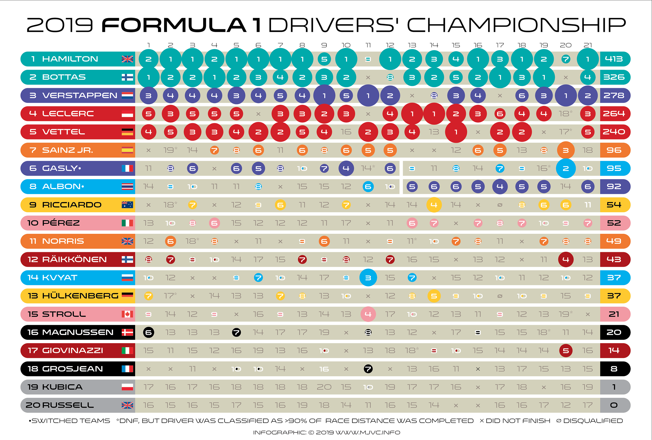
This is the full 2019 season drivers’ championship chart. It shows all results over 21 races for all F1 drivers. Colors represent teams and the size of the colored dots visually highlights top 10 finishes.

Next we switch focus from drivers to teams. This chart shows how both drivers from the top three teams stacked up against each other race per race.
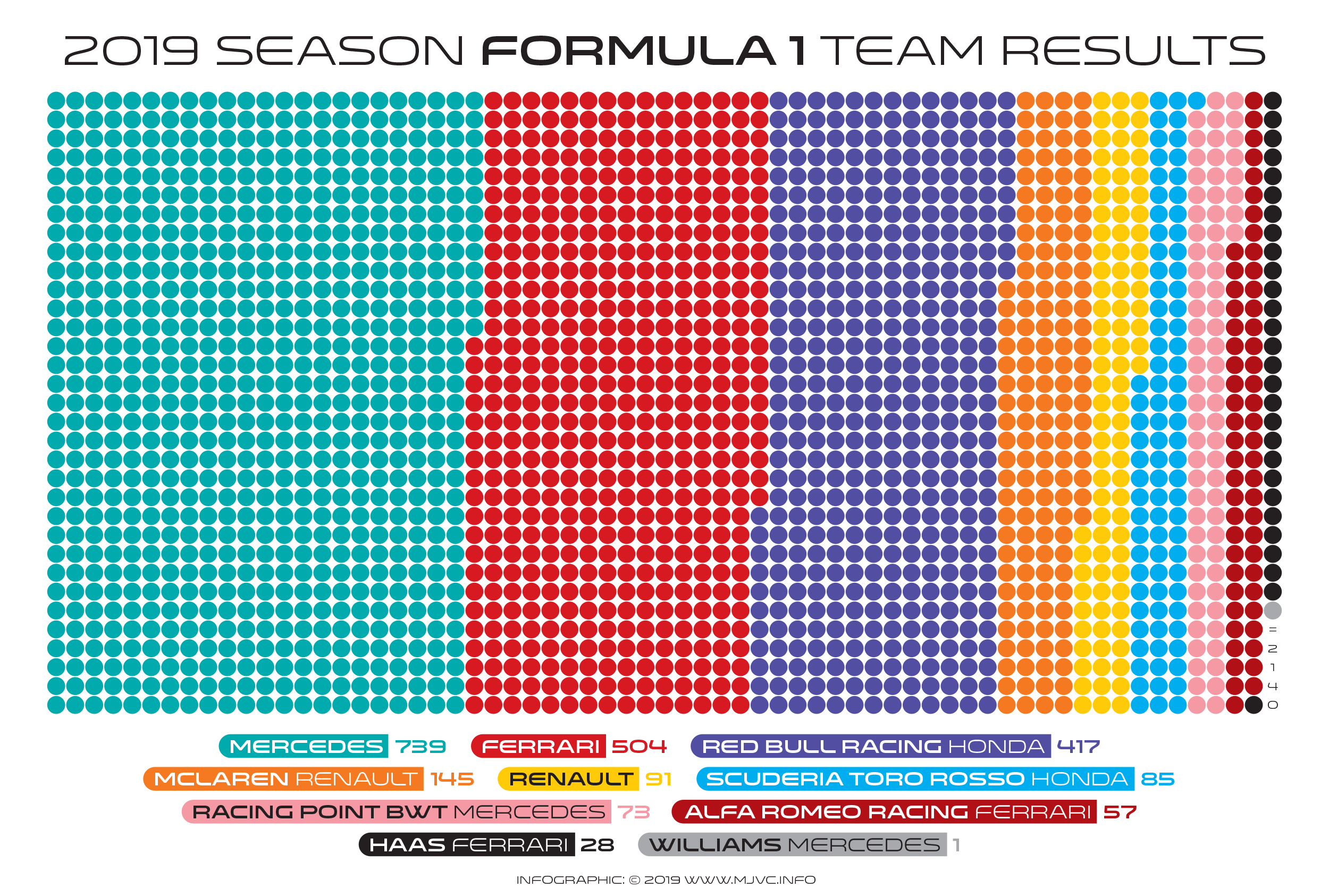
This last chart shows how this seasons constructors championship points were distributed among all ten competing teams.
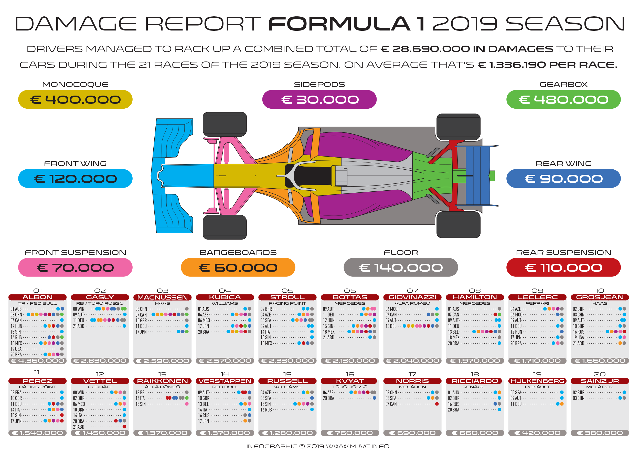
The image above is a bonus graphic about the damages that occurred during the season. It explains average cost for most of the external parts of a F1 car. Damages to engines are not included.